architectural proposal
Transforming a dull document into something a bit different.
A New Approach
Proposals for new projects have an unfortunate tendency to be formulaic with cookie cutter design. Images take a back seat to clunky blocks of text. For an architecture firm, this is particularly problematic because clients are just as eager to see images of projects as they are to read information pertinent to the project at hand. The solution was to merge the two important elements seamlessly while also ensuring there would be diversity in page types.
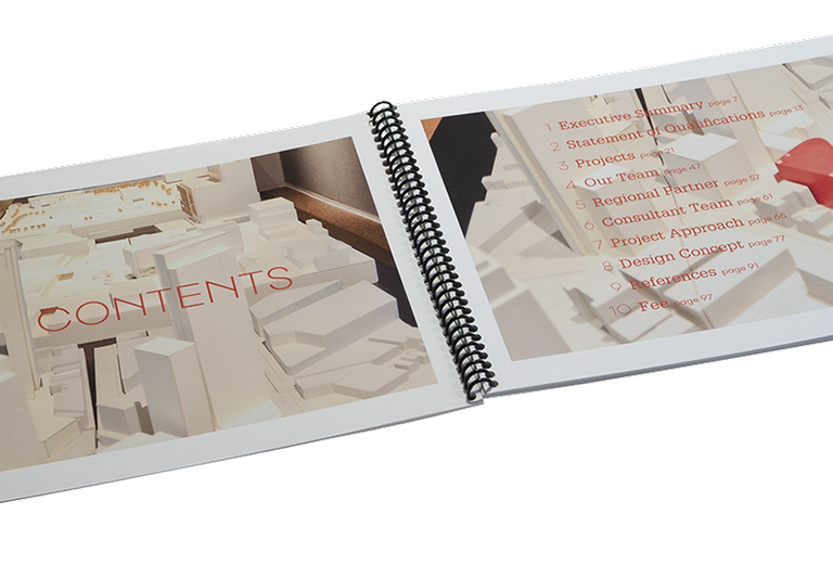
Contents
From the very start type is used as an overlay on the images, taking an otherwise sparse and boring spread and giving it visual interest. The white models are ideal, not fighting the red type.
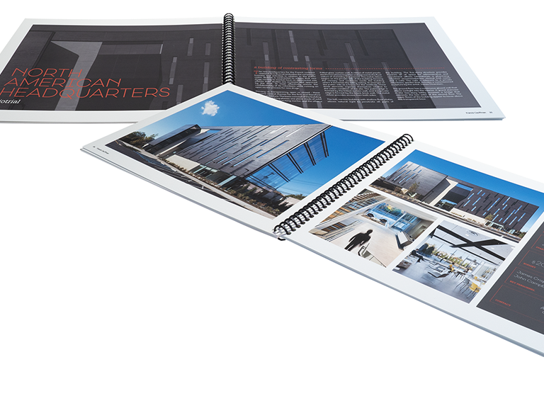
Projects
Project pages were expanded to several spreads, enabling more images and better pacing. Type was placed on dark neutral fields to allow full color images to shine, and projects were introduced with an impactful full spread detail shot.
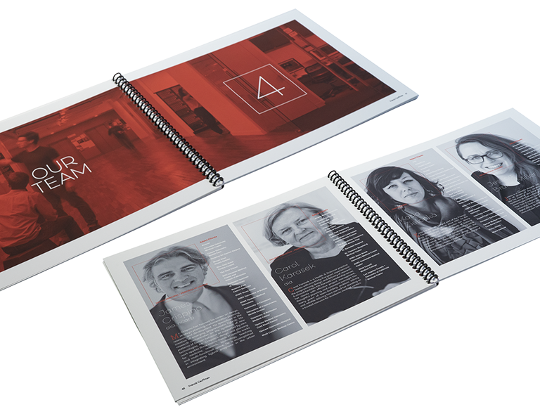
Resumes / dividers
Dividers were kept as a flood of red, making it easy to discern a new section. Resumes were pared down to only the most relevant information and used as an overlay on the normally small portraits.
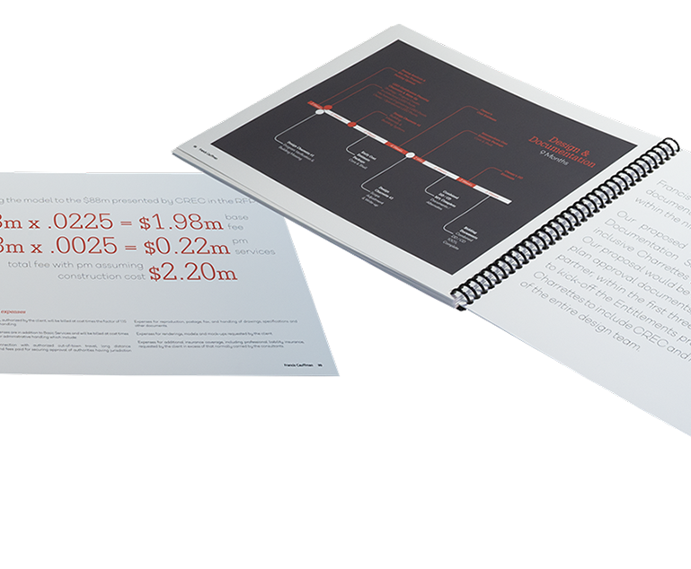
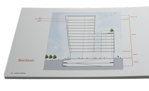
Diagrams
Each chart was given a full page to improve legibility.